Online tools are great to keep you organized. Thank you AA! See new work posted here: https://www.artworkarchive.com/artwork/lisa-sisley-blinn.


Excerpt: #821 was selected for the invitational Fantastical: Art of the Imagination. The exhibit will run from August 25-September 19, 2014, with a reception on Wednesday, September 3, 6-8pm. The exhibit is located in the Donald D. Shook Fine Arts Building, on the beautiful grounds of St. Charles Community College, 4601 Mid Rivers Mall Drive, Cottleville, MO 63376.
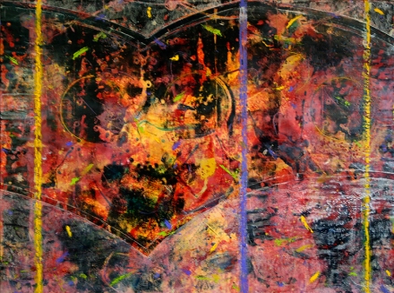
Excerpt: #821
Encaustic with Oil Stick on Cradled Board
36 “x 48″ x 2.5”
2014
This painting is part of a larger series that explores the idea of excerpts or sections of a larger whole, slices of experience that carry meaning: planes of color-space, textural grunge layers, and energetic calligraphic marks convey feelings and clues to an ambiguous location.
Gallery Hours
8 a.m.-8 p.m.
Monday-Thursday
8 a.m.-4 p.m.
Friday
10 a.m.-3 p.m.
Saturday
Join me for a solo exhibit at the Lillian Yahn Gallery, St. Charles County Arts Council. Over 40 works of art. Easy to find in Winghaven, O’Fallon, MO. 7443 Village Center Drive, 636-561-0028.
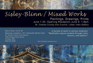
Sisley-Blinn/Mixed Works
Paintings, Drawings, Prints
Solo Show. June 1-30, 2013
St. Charles County Arts Council
I will be at the gallery from 1-8 pm on Saturday June 8 for the reception. There will be an encaustic painting demonstration at 3pm.
Artist Statement
I am drawn to the ideas of liminality, chaos and deeper order, and the subsequent visual constructions of atmospheric environments overlaid with ordered structures.
In other words, in the process of decoding the bombardment of daily information, I try to focus on key concepts of visually fascinating instances. To get to the essence, I strip away the social-cultural temporal interpretations, which leads me to a moment of defined introspection. A cusp between the representational and the knowable, and the less tangible properties of emotion and non-linear identification.
As an example, what may have started as the observation of a wintered field, becomes a recursive process of refining the visual planes, a study of the saturation and dispersion of coloration within the landscape space over time, and the reduction of extraneous noise, such as telephone wires and poles, cars and people, billboards and street signs. Eventually I come to a balance of the essential elements. The question of, “What is catching my attention about this scene?” is closer to being answered.
Often, a horizon line of trees that wind break one field from another may slide up or down the defining space of the painted rectangle. The decision of more sky or more field may result in the line of demarcation sliding off the edge entirely forcing a reevaluation of the newly created internal landscape dialog. Maybe I didn’t actually need the trees, field or sky. Perhaps it is the references that are constructed by light and shadow, texture and pattern that are the subject reinforced by the cool or warmth of the day, energizing scents of the woods, sounds of the birds. The divining out of the essential experience of the space pushes the composition across the cusp from realism to abstraction, from the knowable to the “less sure.”
This chaotic imagery of fluid color and implied movement can be disorienting. So superimposed systematic shapes, grids and restraining lines, repeated patterns and textures are used to create stability: structure over chaos grounding the visual experience. Like looking through a rectangular window frame at the blowing garden leaves and petals on a blustery day. These spots and flows of moving colors, patterns of light and texture, reveal the path of the wind, and perhaps our thoughts.
Mixed Works: A Survey of Work in Various Mediums strives to cover several years of art creation that steps back and forth across the cusp of tangible and intangible interpretation. From minimal landscapes, abstracted bouquets, to distilled internal discussions dependant on color, texture, and pattern which create meanings and relationships. Over all, it is my hope that each piece offers a meditative space, a visual moment of contemplation.
 What started out as a journal exercise of a few hours turned into a 3 week project exploring color and texture, and thinking about reflections from surfaces and thoughts. View the series for “100 Thoughts” on Flickr.
 The reflections off water, glass, marble, and other transparent, translucent or glossy surfaces have always intrigued me. The image that is reflected is often distorted, ambiguous, hazy, blurry, and edited by the shape of the surface. Sometimes, much like our thoughts. Situations and encounters can occasionally leave our thoughts bouncing around like light off a surface: uncertain, out of focus, out of context, or clear but truncated.

“100 Thoughts” is a set of small images that correspond to thoughts that were generated by the act of mark making with encaustic paint on paper. Although some of the images began with an idea, most were “named” after the image was completed. When the actions of the mark making were done, the thought regarding the image crystallized. Titles were kept short to correspond with the small image size, and a specific idea.
All pieces in the set are encaustic with oil bar on Fabriano Artistico paper. The paper is 5 1/2 ” x 6″ (14 cm x 15 cm), images are about 4″ x 4″ (10 cm x 10 cm). Edges were taped, creating a restricted painting/reflection area. Not unlike a print edition, the edges and backs of the paper were kept as clean as possible. Images that were inconsistent with the established theme were removed from the set. Out of an original 116, only 100 were selected for the completed set. The others were added to the original journal entry.
 Some titles from the “100 Thoughts” series:
Answer II
Berries I
Blaze II
Blueberry Kiss II
Creamsicle Sky I
Fever I
Frosting II
Fury I
Glow I
Inner Glow II
Jam I
Jumble Ice I
Last Remark I
Mindful II
Night Mood II
Odd Moment II
Promise I
Rhubarb Vortex I
Startle I
Stormy Light II
Sweetness I
Thinking I
Transpired I
Undecided II
Whispers I
[ No music in the studio today. Only the snoring of 2 cats and a dog, and the soft sounds of heat on metal – the encaustic paints being warmed on the metal palette.]
I used Adobe’s Kuler, online color palette tool, to development the color relationships used in “Rondo Weave: African Violet.” Here is a short version of the steps I used:
1. Experiment with color themes until you are satisfied with a swatch palette that represents your idea. (See post Online: Adobe Kuler Color Tool Rescue.)
Meditation IV: http://kuler.adobe.com/#themeID/429404 (105 color themes and counting!)

2. Choose similar color chips (I stockpile paint chips from various paint stores.) to use in your work area as reference, pick corresponding encaustic base colors that you already have, mix new colors if you need to.

3. Start working …

4. Finished!


Although the final image is different than my original idea, doing the color analysis up front helped me avoid problem colors. Take a look at Kuler and enjoy digital color mixing.
